Best of the Best in Website Navigation

When you arrive at a new site, how do you know where to go? Every site is different, and many are complex. With some websites, the navigation feels more like a chore than part of the enjoyment or essence of the site itself.
Now imagine smarter navigation. Or rather, imagine smarter navigational design. Website navigation has the power to lead visitors to their destination and even shape their impulse to click and engage. These seven companies have diverted from old and tired web navigation standards to reveal simple and engaging (and sometimes uber cool) navigation cues that guide visitors through the site and straight to an awesome customer experience! Explore these seven sites to inspire your own navigational design.
1. Sony “Be Moved” Microsite
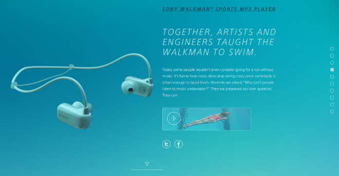
You will undoubtedly be moved by Sony’s microsite – a fantastic single-page design featuring incredibly life-like graphics and the perfect call to action at every pause. It suggests that site navigation does not always imply clickable links. In Sony’s case, powerful design is enough to move visitors down the page until they are submerged in the brand experience. Chances are Sony isn’t losing any sleep over high bounce rates…
2. Dropbox
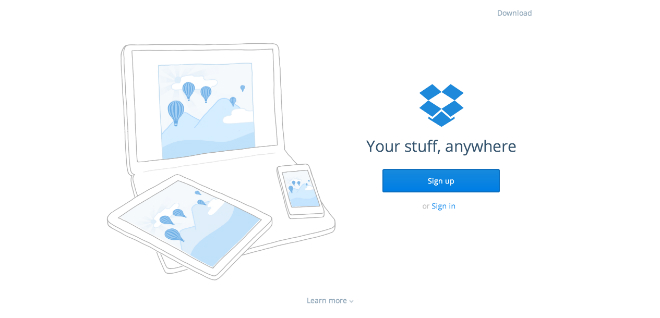
Perhaps the most unique feature of Dropbox’s single-page site is the total absence of site navigation. Above the fold, visitors are presented with three highly qualified calls to action (sign up, sign in, download) and the invitation to scroll. A clever move, if you think about it; why crowd the top of your site with generic links when all you really want is for a visitor to convert? Expect to see more companies follow Dropbox’s lead and take this simplistic route to presenting their primary CTA front and center.
3. The Production Kitchen
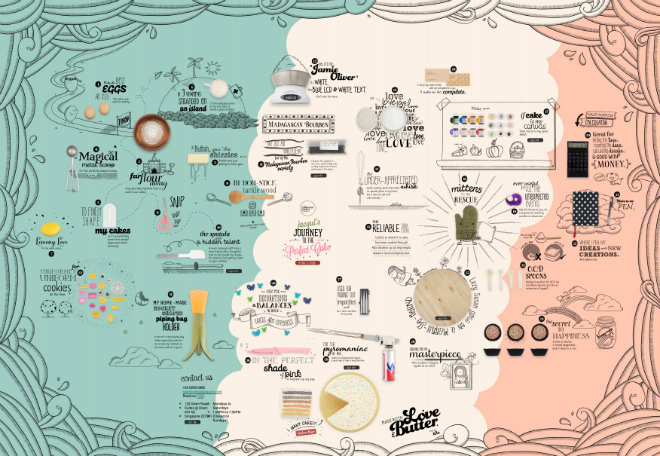
Taking inspiration from Google Maps, or so it would seem, The Production Kitchen by Jacqui Co. is an endearing collage of animated sketches and text. A closer look reveals a numbered path where visitors can travel through “Jacqui’s Journey to the Perfect Cake” – a journey that conjures emotions and whips up quite an appetite! A tiny menu in the lower corner allows visitors to jump to a specific point in this maze of a site, but the awesome click-and-drag navigation is what brings this site to life!
4. Thomson Reuters
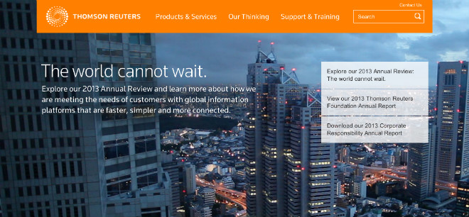
As many large B2B companies know, the more divisions and products you have, the more challenging it is to adopt a simple, sleek website navigation. And yet Thomson Reuters, a global financial services company, made it happen. Despite its expansive services and complex business structure, Thomson Reuters’ website features an innovative design that’s visibly miles ahead of its B2B competitors. How? Like any other aspect of your digital marketing plan, your website should be strategically aligned with a business goal, not designed as a catchall landing page for every visitor inquiry. Prioritize your goals and then prioritize your site to reflect your brand.
5. Square
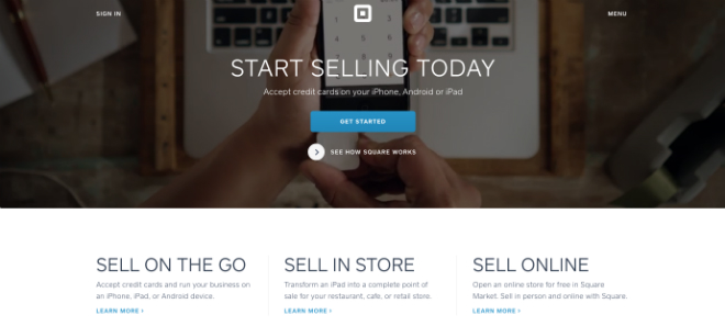
The Square website features a stunningly simple and sparse design. Instead of lining the top of the website with implicit links, Square invites visitors to self-identify as one of three customer types (on the go, in-store, and online retailors) and presents a customized site experience – and call to action – for each user. Additionally, a hidden navigation menu expands to reveal shortcut links to pricing and features, as well as standard site links (About, Privacy, Careers), leaving the footer clean and uncluttered.
6. GiveGab
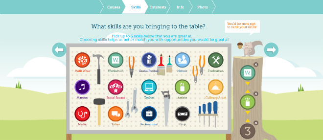
GiveGab, a social network for volunteers and volunteer managers, features outstanding navigation technique within its online sign-up form. GiveGab invites visitors to create an account by navigating through a step-by-step, interactive questionnaire. To progress from one screen to the next, users must identify which visual icons represent their unique interests and skills – such a refreshing alternative to the dated dropdown menu!
7. The Guide To The App Galaxy
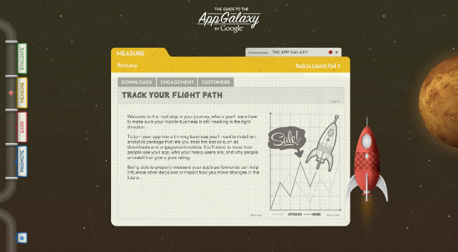
You may be familiar with single-page scroll, but what about a page that scrolls…up? Quite the opposite from our first example (and yet much the same), visitors launch into space and navigate upwards through this guide to the App Galaxy. In a site all about cutting edge app technology, we’d expect nothing less than innovative design, and Google delivers. Turning work into play, this site is more of a game than a guide. How can you use navigation design to alter the tone of your website?